A colour filled evening
I had a rare and wonderful serendipity experience last night.
The annual Resene Colour Awards were on, and as the office had not made a submission this year, I thought the least I could do was wear my yellow leather jacket for the occasion.
Years ago Dulux had a similar function. The MC on that occasion was Gary McCormack ,who lambasted the guests for all wearing black at a Colour Awards event.
One of Billy Connolley’s memorable lines is ‘there are some people who think that black and white are colours’. Most architects and most German Car manufacturers think they are.
So back to my jacket. It approximates Resene colour Corn.
After the various categories were presented the MC announced an inaugural ‘lifetime achievement award’, and proceeded to describe the 40 year career of a certain person, who turned out (huge huge surprise ) to be me.
My jacket made my unprepared speech credible, and I am genuinely thrilled and delighted.
 Colour is a fundamental philosophy with me. I buy cars, on the basis of their colour. I try to use colour to be a no-cost joyful contribution in beige environments .
Colour however is not a ‘free for all’ It must be controlled. It is this difficulty of control that causes timid people to avoid colour decisions.
Looking to nature is a pretty good start as to the use of colour.
The colours of big areas of nature such as sky, sea, or land generally are not as intensely coloured as the less frequent, more mobile and smaller areas of nature, such as sunsets, birds and flowers respectively.
Extrapolating this principle to say cities, you would expect cars and people and billboards to be more vibrant points of colour than the background buildings, streets and footpaths that they are set amongst.
Imagine the reverse with the larger background setting brightly coloured, with the smaller objects, be they cars, people or billboards, coloured beige.
This would somehow be anti-nature and plain wrong.
Colour should accentuates points of interest, and should be used to create interest.
It should be another layer of visual experience. I would rather, for example, paint one wall of a room apple green and the other walls white, than paint the walls a pastel green.
The bright wall reflects itself actively around the white room in different light conditions, where the pastel room is flat and sterile.
 Colour communicates and individualises.
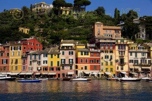
There is a story told in Italy, by tour guides, that the wonderfully coloured houses of say Portofino, were not so for the purpose of creating jigsaw puzzles (although they do ) but so that drunken fishermen returning from a long day at sea, could recognize their individual homes.
Colour is a very personal matter,but we shouldn’t be afraid. We should embrace and not reject it.
